Eurosound rebranding welcome speech
POSTED ON 15 October 2019
Big news! Today, after a decade of dedication, we’re releasing an updated brand identity for Eurosound. You’ll see the new look anywhere we’re out in public, like our website, print-out and very soon you’ll see it in all of our products. We believe the new look better matches what we wish to be: An Audio-visual product provider with the best Price-Performance Value and professional-grade quality. We set our aim to provide the best product for the Pro-AV market over the APAC Regions
Since our founding 10 years ago, we’ve more or less stuck with the same spinning atom logo. It is time to change: we launched new products for Grade A commercial office to help committee decision-making and started hewing more closely to the needs of faculty users. Needless to say, it was time for a change.
Our design goal was to better match how we look to our values and the users we serve. A small team inside the company worked to find something that appeared stable, reliable, smart, trustworthy, and helpful.
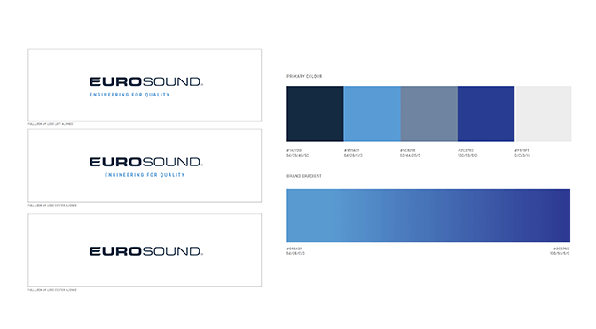
Compared with the old design as a square with monochrome interval, the new solid color wit strong sans serif font is deliberately clean, modern, and confident.
We hope you like this new look and feel for Eurosound! Look out for more updates—like an updated look in our product and a brand-new website—as we continue to try to better serve our clients with clean, modern, user-friendly technology.